We think yes. It's not obvious how users are supposed to navigate through modern websites or applications because there are so many of them. As users we may learn an interface overtime, but the problem is it's not universal. Can you show a multitude of different people the same UI and expect them all to understand it? We think no. In our latest website release here at Three Ventures, we universalized a way to navigate our website on both desktop and mobile devices.
Building Universal Components
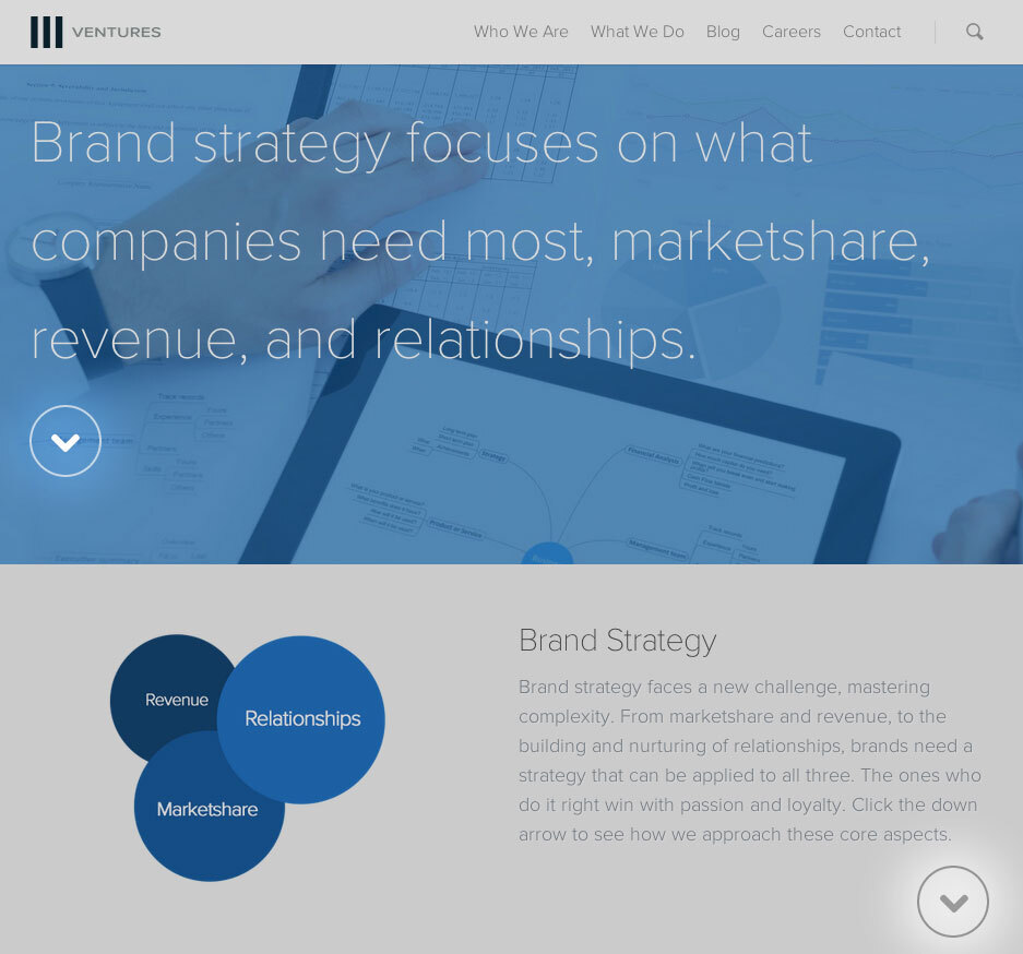
At TEDxDublin, Aris Venetikidi talked about "Making Sense of Mapping". The core concept of this is "maps we draw in our minds" and how to make sense of "abstract images of relationships between places". This principal sparked an idea for user guidance throughout our website. We took an icon that is universal to everyone, the down arrow, and molded it into a tap/click target. When tapped/clicked on, the page automatically scrolls you to the next piece of content we deem important.
Components Train the User
We consistently placed navigation components in the same areas on every page. This allowed the user to go to the next piece of content if they don't know where it was. In cases where the user is at the end of a page, we substituted the arrow with a button that goes to the next page. With such a concept, we believed that it would be effective in guiding users through the important parts of our site.
Guiding the User Towards a Call to Action
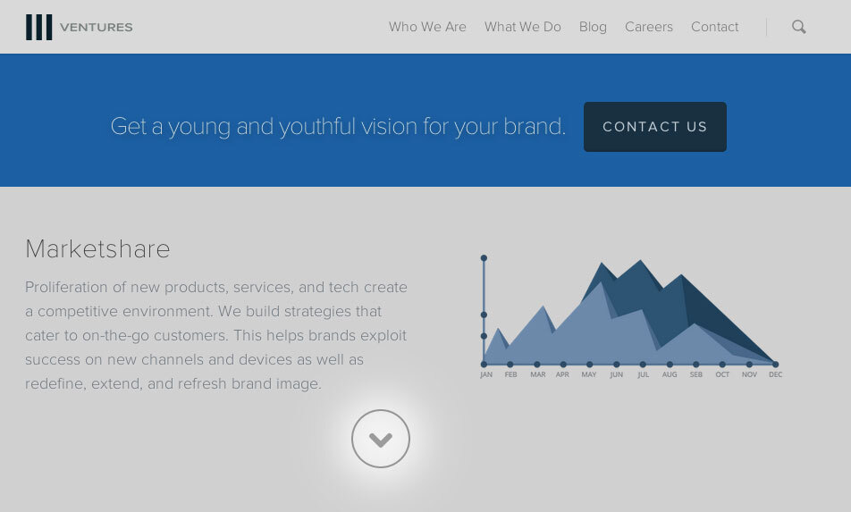
Each arrow we used represents a guide to the new section of content on that page. On some of our services pages, call to actions were used to help segment key parts of information. For example, with our Brand Strategy page, we allowed the user to guide themselves through the first two sections of content before displaying a call to action. The user could decide if they have seen enough information and would like to contact us or if they would like to read more. We kept the next set of content readily available underneath the call to actions so the user could easily continue. For example, this is what a user would see when on our brand strategy page...

...and this is what they see when the arrow under "Brand Strategy" is clicked.

So Where's the Data To Support This?
Our data shows that this idea worked exactly as we wanted it. From February 1st, to April 30th 2014 (Yes that's how long this has been in the que), we gathered data on all pages with navigation components. For this time period, we only had a 2% increase in sessions. The behavior impact:
- Average session duration sky rocketed: 1:22 to 4:15 (+210.36% increase)
- Pageviews increased: 59,466 to 75,966 (+27.77% Increase)
- Bounce rate decreased: 75.96% to 18.79% (-75.26% Decrease, without setting an interaction value for clicking the arrow.)
The conversion impact
- Our goal conversion rate increased: .48% to 2.30% (+372.91% cumulative impact for request to contacts, email signups, and resumes submitted)
- Our contacts generated increased: 28 to 52 (+85.71% Increase)
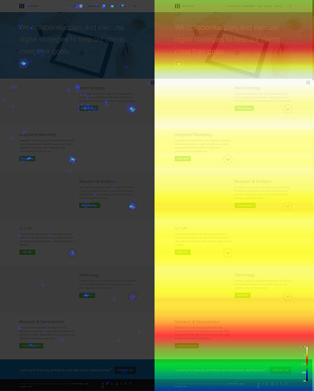
Can you say holy crap! That's a freaking win! In addition, our Crazy Egg analytics also proved to us that more content was being seen further down the page than ever before. On average, ~75% of visitors made it 75% or further down the page. These numbers were so powerful that they out performed our top blog posts!

The Universal Navigation Is Here To Stay!
Universal Navigation is part of many UI/UX experiments we are testing at Three Ventures this year with the goal of rivaling the traditional way of viewing websites. We're not saying we want to be web hipsters, but man are we excited about the increase in behavior and conversion KPIs! Want to benefit from our testing? Be sure to signup for our newsletter and share our content! :) Need help optimizing your website or marketing machine? Get in touch with us.


